The first night I noticed it, the bedroom was perfectly quiet, the kind of hush that usually cradles you toward sleep. I’d turned off my phone, dimmed the lamp, and cracked the window to let in a line of cool air. And yet, my mind wouldn’t slow down. I lay there on my back, staring up at the ceiling, eyelids refusing to grow heavy. It felt like standing at the edge of a lake at dusk, wanting to sink in, but remaining stubbornly stuck on the shore.
Nothing had changed, I thought. Same mattress. Same bedtime tea. Same routine. But that wasn’t quite true. A week earlier I had bought a new bedding set on a whim, drawn to its sleek, hotel-like aesthetic. The pillowcases were a crisp, brilliant white that almost glowed even in low light. They looked clean, fresh, and “perfect” in the catalog kind of way. And yet, night after night, I rolled, blinked, sighed, and woke feeling like I’d barely dipped into sleep at all.
On the fifth restless night, something finally clicked. I’d turned off the lamp and pulled the blanket over my shoulder when a car’s headlights swept past the window. For a second, the room lit up—and my pillowcase flashed like a small, pale beacon beside me. My eyes caught the brightness, just enough to stir me from the verge of sleep. That was the moment I began to wonder: what if the colour I was resting my head on wasn’t just decor, but a subtle disruptor—an invisible hand nudging my nervous system to stay just a little more awake?
The Colour You Sleep On Is Talking to Your Brain
The more I dug into it, the more obvious it seemed: your pillowcase is not a neutral object. It’s one of the last things your eyes register before you drift off and one of the first colours you encounter when you stir in the night. And colour, as it turns out, is not just a visual treat. It is quiet language for your nervous system.
Think about the way a sunset calms you, or the way a fluorescent-lit gas station at midnight makes you feel slightly on edge. Those impressions aren’t accidents; they’re sensory signals. Your eyes pass colour information straight to parts of your brain involved in arousal, emotion, and even hormone regulation. Harsh or bright shades can act like a low-grade alarm; darker, softer tones can whisper to your body that it’s time to power down.
We’re used to talking about screen light and blue wavelengths, about how phones and laptops mess with melatonin. But we often ignore the quieter, subtler light sources and colours in our bedroom: the paint on the wall, the glow from a clock, the fabric wrapped around our pillow. Your pillowcase sits just beneath your line of sight, sometimes close enough that it brushes your lashes when you roll onto your side. Its colour reflects faint ambient light straight toward your eyes.
If that colour is very bright, very light, or very stimulating—think stark white, cherry red, or bold neon—it doesn’t need a lot of light to stand out. Even in a dim room, these shades can feel visually “loud.” The result is the tiniest jolt of alertness, often too small to notice consciously, but large enough to keep you hovering in light, fragile sleep instead of sinking into the deeper stages your body craves.
The Worst Pillowcase Colours for Deep Rest
So which colours are the worst offenders? Imagine your brain as a woodland animal slipping toward its den at night. Certain colours suggest safety and dusk; others scream “daylight” or “danger.” While individual associations vary, there are some patterns that consistently show up when people talk about comfort, rest, and sleep quality.
At one end of the spectrum sits bright white. It’s the darling of hotel marketing and home decor influencers: the colour of “fresh,” “clean,” and “minimalist.” But in low light, white doesn’t just disappear quietly into the background. It reflects more of whatever faint light is available—street lamps, hallway glow, even the little charging dot on your electronics. That reflected brightness makes white pillowcases subtly attention-grabbing, like a pale stone on a dark forest floor.
Then there are the intense, “high-energy” shades. Think vibrant reds, hot pinks, and electric oranges. These colours have long been associated with excitement, passion, alertness, and even slight physiological arousal—faster heart rate, a bit more tension in the body, a mind that leans forward instead of reclining back. They’re excellent for a running shoe or a coffee shop sign; less ideal for the fabric touching your face at midnight.
Sharp yellows and certain bright blues can misfire too. A saturated, taxi-cab yellow or a neon cyan can feel a little like daytime snuck into your bedroom, nudging your brain with the suggestion of activity and alertness. Even bold graphic patterns—crisp black-and-white stripes, geometric prints, loud florals—can be visually busy enough to keep your mind running in tiny loops as you’re trying to wind down.
None of this means that a red pillowcase will doom you to insomnia or that white bedding is inherently bad. But if your sleep already feels fragile—if you wake often, take forever to drift off, or feel oddly wired at bedtime—the colour of your pillowcase might be adding just enough stimulation to tip the scales the wrong way.
The Shade That Cradles You into Deeper Sleep
Somewhere between ink-black and bright white lies a family of colours that behave like twilight. They’re quiet, dusk-like tones that suggest softness, depth, and safety—hues that lean toward cool and muted, rather than loud and glaring. These are the shades most people’s nervous systems interpret as “time to settle.”
If you want to choose a pillowcase colour that actively supports deep rest, aim for the visual equivalent of a calm, overcast sky or a shaded grove. Think:
- Soft, muted blues (more storm-cloud than swimming pool)
- Gentle greys with a hint of blue or slate
- Dusty greens (like sage, eucalyptus, or moss)
- Subtle taupes or mushroom tones
- Muted lavender or heathered lilac, kept soft rather than candy-bright
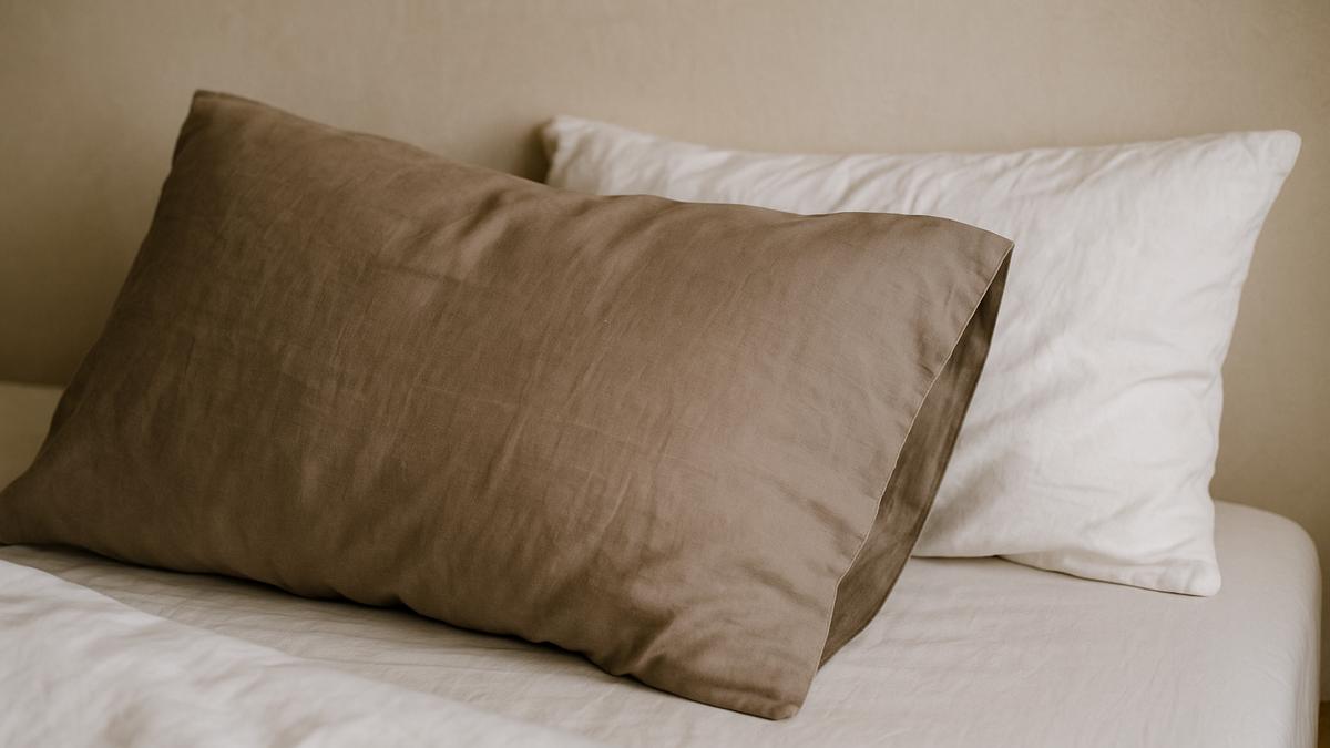
Among these, one category stands out as a kind of universal lullaby: deep, muted blue-grey. Not navy so dark it feels heavy, not baby blue so bright it shouts “daytime sky,” but that middle, stormy-sky shade. It’s the colour of late evening over the ocean or the shadowed side of a distant hill. There’s something about it that your body seems to recognize as “the light is fading now.”
Slide your head onto a pillowcase in this kind of tone and notice what happens. In very low light, instead of bouncing brightness like white, it absorbs it. The edges of the pillow soften into the dimness, your eyes do a little less work, and your brain receives one more cue that it’s safe to release its grip on the day. It’s not magic; it’s subtle environmental support. But when you add up many small signals—quiet colours, dim lights, cooler air—the body takes the hint more easily.
These deeper, muted shades also have another advantage: they hide minor stains and wear, which means you’re less likely to scrutinize every tiny mark as you fluff your pillow. Anxious scanning is not exactly a sleep aid. A pillow that simply looks quietly inviting, like a smooth stone at the edge of a river, helps you slip into rest without friction.
How Different Pillowcase Colours Feel at Night
Here’s a simple way to picture it. If you laid your head on each of these colours at bedtime, how might your nervous system react?
| Pillowcase Colour | Nighttime Effect | Sleep-Friendly? |
|---|---|---|
| Bright white | Reflects light, feels crisp but visually “loud” in the dark. | Often not ideal for sensitive sleepers. |
| Vibrant red or hot pink | Stimulating, energizing, may subtly raise arousal. | Better avoided for pillows. |
| Neon or very bright tones | Attention-grabbing, can feel like “daytime.” | Not recommended for sleep zones. |
| Soft blue-grey or slate | Calming, receding, like twilight or distant hills. | Excellent choice for deeper rest. |
| Sage or moss green | Grounding, nature-linked, gentle on the eyes. | Very sleep-supportive when muted. |
Designing a Nest, Not a Display
If you walk through most home stores, you’ll notice something: the bedding sections are lit bright and cold. The displays are designed to catch your eye, not to cradle your nervous system. Fabrics gleam. White is everywhere. Bold seasonal colours shout from their shelves. But your bedroom is not a showroom. It’s a small ecosystem for your nervous system, more forest glade than magazine spread.
Once you start thinking of it this way, your pillowcase stops being a decorative afterthought and becomes a piece of environmental design. Instead of asking, “Does this look pretty on a shelf?” you start asking, “How will this feel at 11:37 p.m. when I’m tired and a little vulnerable?” It’s a different lens.
When you stand in your bedroom at night with the lights low, notice how each colour behaves. Does the pillowcase flare bright enough to catch your peripheral vision, even in the dark? Do patterns seem to move slightly as your eyes adjust? Are there shiny surfaces that capture streetlight or the glow from a charger? Your goal is not to create a black cave, but a gentle cocoon—edges soft, colours subdued, nothing shouting for your attention.
This is where those twilight shades earn their keep. A deep blue-grey pillowcase next to a softer, lighter grey sheet creates a slow gradient that invites your gaze to rest rather than roam. A muted sage pillow leaning against a darker forest-green headboard feels like a shady grove, not a billboard. If you love pattern, lean into the quiet ones—small, irregular, and tone-on-tone, like dappled shade rather than hard, graphic lines.
Crucially, remember that your pillow is where your face goes. It’s the one piece of bedding you literally breathe into, smell, feel against your cheek, and see up close. Make it the softest, quietest element in the room. Let the bolder accents live further away: a throw at the foot of the bed, a piece of art on the far wall, a plant on a distant shelf.
How to Choose Your Next Pillowcase (and What to Notice)
You don’t need a designer’s eye to choose a pillowcase that nurtures better sleep. You just need to approach it the way you would picking a shady place to sit outside: with your senses awake and your nervous system in mind.
Start with colour family. As a rule, look for muted blues, blue-greys, soft greens, or gentle, earthy neutrals. If you’re drawn to something a little warmer, go for subdued mauve, heathered lavender, or mushroomy taupe instead of peach or bright rose.
Next, test the colour in low light if you can. Step away from the harsh store lighting, or if you’re shopping online, imagine the shade a few notches darker than it appears on your screen. Ask yourself: in a dim room, will this recede or glow? If the answer is “glow,” it might not be your best sleep companion.
Texture matters too. Shiny satin in a pale shade can catch and scatter light like a tiny mirror. A matte finish—like washed cotton, linen, bamboo, or a sateen that’s more velvety than glossy—will drink the light instead. When you brush your hand over the fabric, listen for the little signals: does it feel cool and inviting, or slightly plasticky, even if it looks luxurious?
When that new pillowcase comes home, don’t just throw it into your usual wash and forget it. On the first night, slip into bed, turn the lights down, and notice. How does your body respond to the way your head is framed on that patch of colour? Do your eyes settle more quickly? Does the room feel a degree quieter without you changing anything else?
Colour will never be the only factor in how you sleep, of course. Stress, timing, food, light exposure, and temperature all play enormous roles. But colour is the landscape those other pieces live in. You can’t control every variable in your day; you can decide what shade waits for your head at night.
When You Change the Colour, Notice the Story
The first night I swapped my bright white pillowcase for a smoky blue-grey one, the room felt instantly different, although at first I couldn’t say why. Same mattress. Same tea. Same cracked window. Only now, when I lay back, it was as if my head sank into a small pocket of dusk.
Instead of that pale, floating rectangle at the edge of my vision, the pillow blurred softly into the shadows of the headboard. My eyes didn’t keep darting open to micro-check the room. I remember listening to the wind in the trees outside and the small creaks of the house settling, and then—nothing. The next thing I recall was the faint grey of morning light and the sense that something had been different: no midnight clock checks, no carving my way through shallow, splintered dreams.
Over the next week, I noticed other details. The small anxiety I used to feel when I turned out the lamp—Will my brain behave tonight?—was quieter. My shoulders gave in more quickly. My mind, instead of bouncing between tasks and worries, seemed more willing to drift into those soft, nonsensical half-dreams that mark the border between waking and sleep. It wasn’t that the pillowcase cured anything dramatic; it was that I had quietly stopped asking my brain to work against the room it slept in.
This is how small environmental tweaks often work. You change a colour, or a texture, or where the light falls, and suddenly your body’s old stories about bedtime begin to loosen their grip. The bed stops being a stage where sleep battles happen and goes back to being what it was meant to be: a nest, a burrow, a safe, dark bank along the river where you can finally let go.
Tonight, when you walk into your bedroom, pause at the door for a moment. Let your eyes settle on your pillow. Notice the colour waiting there. Ask yourself, simply and honestly: does this shade invite me to rest—or does it ask me to stay just a little more awake? Your answer doesn’t have to be logical to be real. Your nervous system will usually tell the truth before your decor preferences do.
If your pillow is still shouting, you don’t need a whole bedroom overhaul. You may just need a new place to rest your head: a small square of twilight, a piece of quiet sky sewn into fabric. Sometimes, deeper sleep begins with nothing more complicated than that.
Frequently Asked Questions
Does pillowcase colour really make a big difference to sleep?
Colour is just one factor, but it can matter more than you’d expect. Your pillowcase sits close to your eyes and reflects whatever light is in the room. Bright or highly stimulating colours can keep your brain slightly more alert, while muted, darker tones help your nervous system wind down. On its own, colour won’t fix serious sleep issues, but it can gently support better rest.
Is white bedding always bad for sleep?
Not always. White can feel clean and calming to some people. The concern is that bright white reflects more light, which can be disruptive in already light-filled rooms or for people who are sensitive to visual stimulation. If you love white, you might balance it with darker pillowcases, dimmer lighting, and good blackout curtains.
What’s the best pillowcase colour if I’m not sure what to choose?
A safe, sleep-friendly choice for most people is a muted blue-grey or soft sage green. These shades are calming, recede in low light, and don’t feel too heavy or too bright. Look for colours that remind you of twilight, overcast skies, or shaded leaves.
Do patterns on pillowcases affect sleep too?
They can. Bold, high-contrast patterns—like sharp black-and-white stripes or loud florals—can feel visually “busy” and keep your eyes and brain more active. If you like patterns, choose soft, subtle, tone-on-tone designs that feel more like gentle texture than bold graphics.
Besides colour, what else should I consider when choosing a pillowcase for better sleep?
Pay attention to texture, breathability, and how the fabric feels on your skin. Matte finishes are less reflective than shiny ones, which helps in low light. Natural or breathable materials like cotton, linen, or bamboo can keep you cooler and more comfortable. And always consider the whole environment: light levels, temperature, noise, and your evening habits all work together with your pillowcase colour to shape how well you rest.

Hello, I’m Mathew, and I write articles about useful Home Tricks: simple solutions, saving time and useful for every day.